Forum Heading
- Grah
- Posts: 103
- Joined: Mar 23, 2018
It would be nice to have a major heading of 'Trombone Chat' and some kind of an illustration of a trombone at the top of the forum. Instead of the silly cup and phpBB thing.
- BGuttman
- Posts: 7368
- Joined: Mar 22, 2018
I think we'd all like that, Grah. You have a nice trombone graphic?
Brian is looking for something.
Note that the coffee cup is one "skin" that you can select. It's called Latte (or Latte Red; don't remember which they chose). In your profile you can select a couple of other skins. I use the one we used to have called prosilver. Apparently it doesn't do as well on small screens like phones so it was not made the default.
- Matt_K
- Posts: 4809
- Joined: Mar 21, 2018
Yep! Brian actually has one but the color is a little bit different than the background color of the site. I've looked a little into having one made but a halfway decent one costs at least $500. We could start a kick starter! ;)
- hyperbolica
- Posts: 3990
- Joined: Mar 23, 2018
Hey, my wife does a lot of graphic arts stuff, and volunteered to help. If you send the image you want to match and whatever editing requirements, she can turn it around this weekend.
- Neo_Bri
- Posts: 1342
- Joined: Mar 21, 2018
[quote="hyperbolica"]Hey, my wife does a lot of graphic arts stuff, and volunteered to help. If you send the image you want to match and whatever editing requirements, she can turn it around this weekend.[/quote]
That's awesome! We're trying a preliminary one I made and we'll go from there. It was very last minute, so she'd probably be much better than me. I suck at Photoshop.
That's awesome! We're trying a preliminary one I made and we'll go from there. It was very last minute, so she'd probably be much better than me. I suck at Photoshop.
- Matt_K
- Posts: 4809
- Joined: Mar 21, 2018
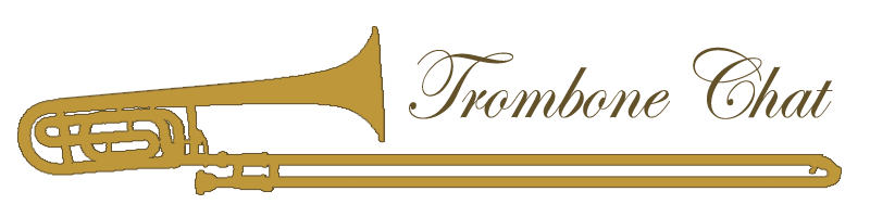
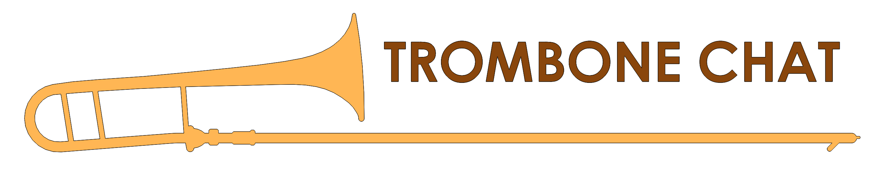
Awesome! Brian finished one and its technically the official logo, but it isn't populating to everyone immediately because of caching. You can see it here:
<LINK_TEXT text="https://trombonechat.com/styles/latte/t ... s/logo.png">https://trombonechat.com/styles/latte/theme/images/logo.png</LINK_TEXT>
Brian, any thoughts on using a logo + text instead of text with a logo behind it perhaps?
<LINK_TEXT text="https://trombonechat.com/styles/latte/t ... s/logo.png">https://trombonechat.com/styles/latte/theme/images/logo.png</LINK_TEXT>
Brian, any thoughts on using a logo + text instead of text with a logo behind it perhaps?
- Neo_Bri
- Posts: 1342
- Joined: Mar 21, 2018
[quote="Matt K"]Awesome! Brian finished one and its technically the official logo, but it isn't populating to everyone immediately because of caching. You can see it here:
<LINK_TEXT text="https://trombonechat.com/styles/latte/t ... s/logo.png">https://trombonechat.com/styles/latte/theme/images/logo.png</LINK_TEXT>
Brian, any thoughts on using a logo + text instead of text with a logo behind it perhaps?[/quote]
Give me an example. Like this?
<LINK_TEXT text="https://trombonechat.com/styles/latte/t ... s/logo.png">https://trombonechat.com/styles/latte/theme/images/logo.png</LINK_TEXT>
Brian, any thoughts on using a logo + text instead of text with a logo behind it perhaps?[/quote]
Give me an example. Like this?
- Matt_K
- Posts: 4809
- Joined: Mar 21, 2018
Perhaps something like this:
But not the image itself obviously with the slide extended so as to underline the words 'Trombone Chat'.
(Hard to get more iconic than a closed wrap 42 or 88!)
But not the image itself obviously with the slide extended so as to underline the words 'Trombone Chat'.
(Hard to get more iconic than a closed wrap 42 or 88!)
- Matt_K
- Posts: 4809
- Joined: Mar 21, 2018
I'm thinking something like this:
<GOOGLEDRIVE id="16ELvn0SIrGY7Qz-yJszKZgXhoXBEl1CUYg"><LINK_TEXT text="https://drive.google.com/file/d/16ELvn0 ... sp=sharing">https://drive.google.com/file/d/16ELvn0SIrGY7Qz-yJszKZgXhoXBEl1CUYg/view?usp=sharing</LINK_TEXT></GOOGLEDRIVE>
Except better than my horrible stencil of the 42...
And maybe with the font similar to the original logo:

But perhaps with only the darker color for font (as Brian has done here).
Then making the background transparent so we could use it for all of the themes.
<GOOGLEDRIVE id="16ELvn0SIrGY7Qz-yJszKZgXhoXBEl1CUYg"><LINK_TEXT text="https://drive.google.com/file/d/16ELvn0 ... sp=sharing">https://drive.google.com/file/d/16ELvn0SIrGY7Qz-yJszKZgXhoXBEl1CUYg/view?usp=sharing</LINK_TEXT></GOOGLEDRIVE>
Except better than my horrible stencil of the 42...
And maybe with the font similar to the original logo:
But perhaps with only the darker color for font (as Brian has done here).
Then making the background transparent so we could use it for all of the themes.
- hyperbolica
- Posts: 3990
- Joined: Mar 23, 2018
[quote="Neo Bri"]I can work on this now.
Thoughts, Hyperbolica?[/quote]
Yeah, we can use that image to get the outline, extend the slide, and place some text over the extended slide. Change the colors to match the theme(s?) Are there multiple themes, or should we just plan a single header color to match any possible theme?
We also need to know the sizes for the header - I'm assuming a desktop and a mobile header?
- hyperbolica
- Posts: 3990
- Joined: Mar 23, 2018
[quote="Matt K"]I'm thinking something like this:
<GOOGLEDRIVE id="16ELvn0SIrGY7Qz-yJszKZgXhoXBEl1CUYg"><LINK_TEXT text="https://drive.google.com/file/d/16ELvn0 ... sp=sharing">https://drive.google.com/file/d/16ELvn0SIrGY7Qz-yJszKZgXhoXBEl1CUYg/view?usp=sharing</LINK_TEXT></GOOGLEDRIVE>
Except better than my horrible stencil of the 42...
And maybe with the font similar to the original logo:
But perhaps with only the darker color for font (as Brian has done here).
Then making the background transparent so we could use it for all of the themes.[/quote]
Yeah, ok, we're on the same page. I'll put it together and post back here.
- Matt_K
- Posts: 4809
- Joined: Mar 21, 2018
The size of the header doesn't matter to a large extent. However, there should be two... one "HD" theme and one "SD" theme. The HD theme should be twice as large as the SD theme so something around 800x200 for the HD and 400x100 for the SD theme.
Let me look at the other themes real quick to see if we should have others made with multiple fonts.
Let me look at the other themes real quick to see if we should have others made with multiple fonts.
- Matt_K
- Posts: 4809
- Joined: Mar 21, 2018
Okay, I think if we use this brownish hue (the darker of the browns from the original header), one with the text as white, and one where the text is a lighter shade of blue that should cover all the use cases we'd have.
Maybe make the trombone bell the goldish/light brown of the original logo and the darker brown for the linkages or something like that?
Maybe make the trombone bell the goldish/light brown of the original logo and the darker brown for the linkages or something like that?
- RichC
- Posts: 177
- Joined: Mar 23, 2018
[quote="Matt K"]The size of the header doesn't matter to a large extent. However, there should be two... one "HD" theme and one "SD" theme. The HD theme should be twice as large as the SD theme so something around 800x200 for the HD and 400x100 for the SD theme.
Let me look at the other themes real quick to see if we should have others made with multiple fonts.[/quote]
You should be able to use the largest (& best resolution) graphic for either as this is probably a responsive design? Set the image to 100% and it should adjust automatically within the div to what the browser requires. might depend on the coding, though. Just my (not solicited 2) 2 cents.
- mrpillow
- Posts: 89
- Joined: Mar 23, 2018
Unless you want people on 4K monitors to have a horrible pixelated experience, 800x200 for the "HD" theme is far too small.
- Matt_K
- Posts: 4809
- Joined: Mar 21, 2018
[quote="mrpillow"]Unless you want people on 4K monitors to have a horrible pixelated experience, 800x200 for the "HD" theme is far too small.[/quote]
The original HD image is actually smaller than that. It basically scales to fit the entirety of the upper margins unless it's smaller, in which case it doesn't downscale but takes up less space. (I don't know if yours has updated yet to see the current image, but the 'Search' bar is actually on top of chat on browsers so we're trying to avoid that.)
I do have a 4k monitor, though I hate using it in that mode because I have to blow up all of the text to make it readable by a human (and I have pretty good vision at least nearsighted). So I can test on it. Though maybe make it much bigger and then downsize it sine that's a lot easier to go that direction than otherwise? Maybe 2000 wide?
- Neo_Bri
- Posts: 1342
- Joined: Mar 21, 2018
If we use compressed vector art we should be able to make it whatever size without being too large, file-size-wise.
- mrpillow
- Posts: 89
- Joined: Mar 23, 2018
Image resolution is like proper gain staging in audio recording. Start with the most signal possible, and downsize from there as needed. Better to have to shrink a large image than blow up a small one.
- hyperbolica
- Posts: 3990
- Joined: Mar 23, 2018
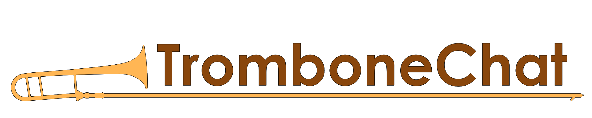
Vector art is a different beast. Here is my wife's first take on it. She added an outline to the trombone, which was modeled from a 36b on the CS site. Let's see if this works for the HD
- hyperbolica
- Posts: 3990
- Joined: Mar 23, 2018
Looks good on a light background, not so good on a dark background. Other feedback?
- Neo_Bri
- Posts: 1342
- Joined: Mar 21, 2018
[quote="hyperbolica"]Looks good on a light background, not so good on a dark background. Other feedback?[/quote]
Good first take. Can she "unpixelate" the edges? In other words, remove the jaggies and smooth the whole thing?
Good first take. Can she "unpixelate" the edges? In other words, remove the jaggies and smooth the whole thing?
- hyperbolica
- Posts: 3990
- Joined: Mar 23, 2018
[quote="Neo Bri"]<QUOTE author="hyperbolica" post_id="279" time="1522006456" user_id="104">
Looks good on a light background, not so good on a dark background. Other feedback?[/quote]
Good first take. Can she "unpixelate" the edges? In other words, remove the jaggies and smooth the whole thing?
</QUOTE>
That's antialias, I've already asked her for that. I'll check on progress.
Looks good on a light background, not so good on a dark background. Other feedback?[/quote]
Good first take. Can she "unpixelate" the edges? In other words, remove the jaggies and smooth the whole thing?
</QUOTE>
That's antialias, I've already asked her for that. I'll check on progress.
- Neo_Bri
- Posts: 1342
- Joined: Mar 21, 2018
Thinking about it more, I like the simplicity of a straight trombone more, perhaps. And the florid font isn't my taste, either. I think in this case cleaner will be better. Too much detail.
I'll wait for others to chime in, though.
I'll wait for others to chime in, though.
- Matt_K
- Posts: 4809
- Joined: Mar 21, 2018
It looks awesome good with the caveats mentioned by others. I was doing some minor touch ups to see if possible.
I agree with Brian about the font. Maybe a touch less ornate but I do like the flavor it brings. I do like the closed wrap personally. I do wish we could find a picture that was more of a 90 degree angle of the bell section but I do still like this angle.
What do we think about the font relative to the bell/ Maybe making the bell roughly the same size as the text would be good too?
- ronnies
- Posts: 61
- Joined: Mar 23, 2018
Not so sure I like the flatness of the image of the trombone esepecially since it's a real trombone it just looks odd to me. Would perhaps work if it wasn't a real image,or if it was a straight trombone as the vavle rap looks really odd. Have to agree it doesn't work on the dark background.
Ronnie
Ronnie
- hyperbolica
- Posts: 3990
- Joined: Mar 23, 2018
Ok, most of that is easy to change. Putting a solid background behind it eliminates some of the jaggies. Maybe we can let it sink in for a while, and give everyone a chance to catch up. Does anyone want to suggest a font or capture an example of one you like?
- Matt_K
- Posts: 4809
- Joined: Mar 21, 2018
I went through WOrd looking at a variety of options on trombone chat and chose 4 that I like, which I've attached the image of at the bottom.
Inkpen 2 would be cool as it's a relevant font for music. I don't know if it would look good on the site at the top, but definitely an option. I've always been parital to Lucida Calligraphy, so not cursive but I think looks cool too.
If she can't get the jagged edges off of the trombone itself, I can touch that part up in gimp. I can smooth out some of the edges. It's a little time consuming but once we settle on something worth it since we can use that part of the graphic for the others.
- BGuttman
- Posts: 7368
- Joined: Mar 22, 2018
I think the Monotype Corsiva will be easier to read on a small screen although it's really close to the Lucida.
I know Brian had talked about a "scriptish" font, but the other skins use a font like Bauhaus (a bold sans-serif with rounded ends) or Trebuchet.
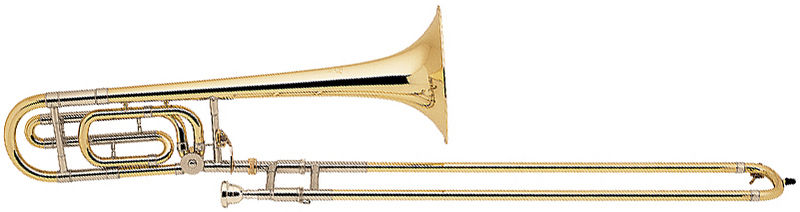
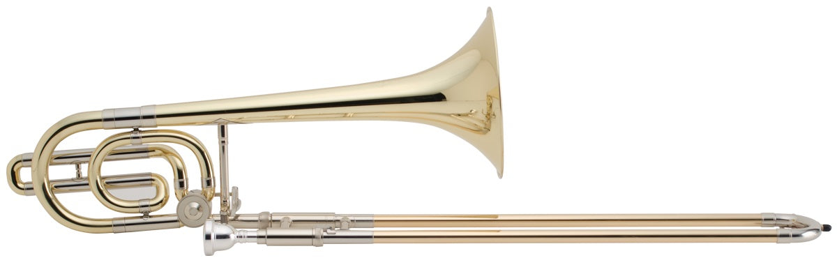
I'm really open to any suggestions. If we go with the Bach 36B, is it possible to "trim" the width of the tubing to make it cleaner looking? You might get a nicer background from a Holton 185 or Conn 88H (smaller wide loop and longer narrow loop).
I wish I could find the drawing I made for my business card. It's a stylized Holton/Conn loop and can accept text really well. Maybe I'll post a scan when I get a chance.
I know Brian had talked about a "scriptish" font, but the other skins use a font like Bauhaus (a bold sans-serif with rounded ends) or Trebuchet.
I'm really open to any suggestions. If we go with the Bach 36B, is it possible to "trim" the width of the tubing to make it cleaner looking? You might get a nicer background from a Holton 185 or Conn 88H (smaller wide loop and longer narrow loop).
I wish I could find the drawing I made for my business card. It's a stylized Holton/Conn loop and can accept text really well. Maybe I'll post a scan when I get a chance.
- Matt_K
- Posts: 4809
- Joined: Mar 21, 2018
A Conn 36H might be even better yet. A shot of the horn with a 90 degree angle (perpendicular to the ground) would be good at creating some level of definition between the lower tubes as well.
- Matt_K
- Posts: 4809
- Joined: Mar 21, 2018
And I don't know how difficult this would be... but instead of making it one single color... making it two colors or perhaps some kind of reduced color palette that distinguished the nickel trim from the yellow brass??? Just thinking aloud, visual stuff is not my strong point by any sense of the word...
- hyperbolica
- Posts: 3990
- Joined: Mar 23, 2018
Yeah, all that is doable. We just need a consensus.
- Neo_Bri
- Posts: 1342
- Joined: Mar 21, 2018
Bruce, I'm more in favor of very basic fonts, no serifs, etc. I want clean and easy.
Reduced color palette goes along with that philosophy.
Fewer loops in the trombone also go along with this philosophy.
And this philosophy will work even better on smaller screens.
Reduced color palette goes along with that philosophy.
Fewer loops in the trombone also go along with this philosophy.
And this philosophy will work even better on smaller screens.
- BGuttman
- Posts: 7368
- Joined: Mar 22, 2018
Here's what I have on my business card. Note that I drew this using AutoCAD Release Candidate on a Wang PC (equivalent to a PC-XT). Original had to be plotted on a flatbed.
- Neo_Bri
- Posts: 1342
- Joined: Mar 21, 2018
I like the simple fonts and the simple design. Let's keep it simple, please. I really also feel that we should use vector graphics to simply draw a simple trombone-shaped object (TSO) and use vector fonts - and call it good. It'll look really solid on any screen then.
- hyperbolica
- Posts: 3990
- Joined: Mar 23, 2018
Ok, how about this- 6h profile, side view of slide. A nice block font. I'll do it all in SolidWorks and we can vector and antialias all day long.
Colors?
Colors?
- Neo_Bri
- Posts: 1342
- Joined: Mar 21, 2018
Also, one more thing - TromboneChat is one word.
So let it be written, so let it be done.
So let it be written, so let it be done.
- jack
- Posts: 9
- Joined: Mar 26, 2018
[quote="mrpillow"]Unless you want people on 4K monitors to have a horrible pixelated experience, 800x200 for the "HD" theme is far too small.[/quote]
It's been mentioned, but I really think designing the logo as a vector graphic (specifically SVG) is the solution here - that way it will scale for any screen resolution. Obviously it also has the benefit of being a tiny file size too.
It's been mentioned, but I really think designing the logo as a vector graphic (specifically SVG) is the solution here - that way it will scale for any screen resolution. Obviously it also has the benefit of being a tiny file size too.
- LowrBrass
- Posts: 17
- Joined: Mar 25, 2018
Speaking as someone whose day job is in an artsy-fartsy field... I like the existing header (which Matt K linked towards the beginning of this discussion, and is the current header on the website), and I don't see a compelling reason to change it right now.
- tbathras
- Posts: 122
- Joined: Mar 23, 2018
[quote="LowrBrass"]Speaking as someone whose day job is in an artsy-fartsy field... I like the existing header (which Matt K linked towards the beginning of this discussion, and is the current header on the website), and I don't see a compelling reason to change it right now.[/quote]
I agree - it's simple and clean looking to me, and I'm looking at it in 4k resolution.
I agree - it's simple and clean looking to me, and I'm looking at it in 4k resolution.
- mwpfoot
- Posts: 97
- Joined: Mar 23, 2018
Looks nice, POW! :pant:
A request for when you want to add another theme, which I totally understand may not be today or tomorrow or even next week, is to provide us working stiffs with discreet option: white background, black text, minimal header, ya know something that looks like a work document on a work computer. No reason, really.
<span class="emoji" title=":wink:">😉</span>
- Matt_K
- Posts: 4809
- Joined: Mar 21, 2018
You might want to try the flat themes we have installed. They're quite discreet
- PhilipEdCarlson
- Posts: 111
- Joined: Mar 23, 2018
[quote="mwpfoot"]something that looks like a work document on a work computer.
<span class="emoji" title=":wink:">😉</span>[/quote]
IMHO, this is the MOST practical suggestion yet!
This suggestion actually helped me feel better about reading board comments in the first place. There are so many comments now that I'm not really going to even try to keep up with them all. But, I had felt guilty about reading what I have so far because I figured that time spent reading this board was time that I could have been playing my horn. But, now I realize that most of the time I spend reading these posts is time that I couldn't spend practicing anyway because...
Well, let's just say this was THE best suggestion!
(I think this was my 3rd post!)
- hyperbolica
- Posts: 3990
- Joined: Mar 23, 2018
Ok, comments?
- BGuttman
- Posts: 7368
- Joined: Mar 22, 2018
Personally I'd prefer a Caps/Lower case name. But that's just me.
Incidentally, if you want to appropriate my diagram of a trombone, feel free. Wish I had the original AutoCAD file at hand. It's on a floppy disk somewhere ... :frown:
Incidentally, if you want to appropriate my diagram of a trombone, feel free. Wish I had the original AutoCAD file at hand. It's on a floppy disk somewhere ... :frown:
- Neo_Bri
- Posts: 1342
- Joined: Mar 21, 2018
I like the trombone outline - sleek.
I like mine, too, though it could be refined quite a bit. I'll stay out of the discussion henceforth.
I like mine, too, though it could be refined quite a bit. I'll stay out of the discussion henceforth.
- Neo_Bri
- Posts: 1342
- Joined: Mar 21, 2018
By the way - 53 posts and counting - i wouldn't mind 100 posts per page.
- Matt_K
- Posts: 4809
- Joined: Mar 21, 2018
I think the only thing I would personally change about it is to make the trombone perhaps a little smaller and the words a little bigger --- at least as big as the bell. I like the all caps. Very clear. Matches the clarity you get without the F attachment... anyone else?
- Matt_K
- Posts: 4809
- Joined: Mar 21, 2018
Ah I forgot about that. In that case, maybe we should have mixed lettering. Otherwise it'll just be TROMBONECHAT Which isn't as legible to me at least.
- Neo_Bri
- Posts: 1342
- Joined: Mar 21, 2018
Notice that my header above is mixed-case.
TromboneChat
I think it's legible.
TromboneChat
I think it's legible.
- ronnies
- Posts: 61
- Joined: Mar 23, 2018
Being a bit nitpicky, but does anyone else find the fact the bell stays aren't parallel slightly annoying?
Ronnie
Ronnie
- Matt_K
- Posts: 4809
- Joined: Mar 21, 2018
I meant that ALLCAPS wouldn't be as legible as MixedCase not that we should add a space :)
[quote="ronnies"]Being a bit nitpicky, but does anyone else find the fact the bell stays aren't parallel slightly annoying?
Ronnie[/quote]
I've never had a trombone that had them parallel! That would be an uncomfortable horn to hold indeed, though it isn't as prominent a feature as when you're abstracting out to a single color and putting it in a banner!
- ronnies
- Posts: 61
- Joined: Mar 23, 2018
[quote="Matt K"]I meant that ALLCAPS wouldn't be as legible as MixedCase not that we should add a space :)
<QUOTE author="ronnies" post_id="443" time="1522138551" user_id="78">
Being a bit nitpicky, but does anyone else find the fact the bell stays aren't parallel slightly annoying?
Ronnie[/quote]
I've never had a trombone that had them parallel! That would be an uncomfortable horn to hold indeed, though it isn't as prominent a feature as when you're abstracting out to a single color and putting it in a banner!
</QUOTE>
Why would it be uncomfortable? I think all the straight trombones I've played have had all the bell stays parallel. Maybe I'm odd though. :-)
Ronnie
- hyperbolica
- Posts: 3990
- Joined: Mar 23, 2018
About the braces, this was traced from an image, and they definitely weren't parallel in the image, there's some perspective going on with the image. The distance from the "camera" to the object is about the same as the distance between the stays, so due to perspective, they won't seem parallel, even if they actually are. The only way for them to actually look parallel is to get the camera very far from the object (or use an idealized system like CAD where we ignore perspective).
So, mixed case, larger letters, smaller bone.
Having made these changes, I do like this new one better.
So, mixed case, larger letters, smaller bone.
Having made these changes, I do like this new one better.
- LowrBrass
- Posts: 17
- Joined: Mar 25, 2018
I mean all of this constructively: :hi:
I still like Neo Bri's logo (aside from maybe the wonky-looking mouthpiece angle, and whatever's going on with that spit valve). I don't totally understand what you're hoping to gain out of this redesign, other than satisfying personal aesthetics, but since ya'll seem dead set on changing it...
Concept is good.
* The mouthpiece intersecting with the brace is visually confusing/unattractive. Could be solved by redrawing at an angle so the slide isn't completely head-on.
* I agree with Ronnie, I'd prefer if the bell and slide were parallel to each other, even if it's not 100% realistic. It'd feel stronger, more balanced, more intentional, less "I had to draw it this way because that's the way my photo was."
(I realize these two comments would likely require a pain-in-the-ass total redraw)
* All caps vs. sentence-case: You could try small caps and make everyone happy.
ex.
[size=150]TROMBONE[size=150]CHAT
There's a button for it in most 2D design programs that can handle text. It takes sentence case and converts it into the sort of big-little caps treatment I just did by hand. (Doing it by button instead of by hand can help make sure you get the proportions right)
* How does it look with slightly tighter kerning? I feel like the letters are awfully far apart from each other. I'm not 100% sure, I'd need to see it.
* I may have missed this part of the discussion... is the outline of the trombone intentional?
I'd get rid of it entirely.
If you're worried about not being able to see the yellow, maybe darken the yellow to ensure it shows up on all themes.
If you really want to keep the outline, maybe knock the color back to something more subtle--a slightly darker shade of the same yellow color on the bell.
I'm not trying to pick on anyone's design skills (maybe a little :) ). It's a good start. I just think it can be even better!
...But I'm not the client, so really this is all just my $0.02.
I still like Neo Bri's logo (aside from maybe the wonky-looking mouthpiece angle, and whatever's going on with that spit valve). I don't totally understand what you're hoping to gain out of this redesign, other than satisfying personal aesthetics, but since ya'll seem dead set on changing it...
Concept is good.
* The mouthpiece intersecting with the brace is visually confusing/unattractive. Could be solved by redrawing at an angle so the slide isn't completely head-on.
* I agree with Ronnie, I'd prefer if the bell and slide were parallel to each other, even if it's not 100% realistic. It'd feel stronger, more balanced, more intentional, less "I had to draw it this way because that's the way my photo was."
(I realize these two comments would likely require a pain-in-the-ass total redraw)
* All caps vs. sentence-case: You could try small caps and make everyone happy.
ex.
There's a button for it in most 2D design programs that can handle text. It takes sentence case and converts it into the sort of big-little caps treatment I just did by hand. (Doing it by button instead of by hand can help make sure you get the proportions right)
* How does it look with slightly tighter kerning? I feel like the letters are awfully far apart from each other. I'm not 100% sure, I'd need to see it.
* I may have missed this part of the discussion... is the outline of the trombone intentional?
I'd get rid of it entirely.
If you're worried about not being able to see the yellow, maybe darken the yellow to ensure it shows up on all themes.
If you really want to keep the outline, maybe knock the color back to something more subtle--a slightly darker shade of the same yellow color on the bell.
I'm not trying to pick on anyone's design skills (maybe a little :) ). It's a good start. I just think it can be even better!
...But I'm not the client, so really this is all just my $0.02.
- hyperbolica
- Posts: 3990
- Joined: Mar 23, 2018
Lowrbrass,
Some of your suggestions have already been discussed and decided the other way. Group design projects can involve a lot of tail chasing if you can't make decisions. I'm not designing this, just taking input and making an image. I'm deferring to the people who started this site before we needed it, Brian and Matt .
Input is great, but maybe read the rest of the thread to see what ground we've already covered. Or you can create and propose an image.
- jack
- Posts: 9
- Joined: Mar 26, 2018
[quote="hyperbolica"][/quote]
I like this a lot! It's better than the current one in my opinion. The only thing that looks slightly off to me are the colors. It doesn't match the muted colors of the theme, but maybe that was on purpose? It definitely stands out more as is, but I prefer the colors used in the current heading.
Going back to my previous comment, I think once the design is finalized it should be SVG, rather than PNG for several reasons. The first reason goes back to this:
[quote="Matt K"]Okay, I think if we use this brownish hue (the darker of the browns from the original header), one with the text as white, and one where the text is a lighter shade of blue that should cover all the use cases we'd have.[/quote]
With SVG, colors and outline can be changed on the fly with a few lines of CSS code added to each theme, it's very adaptable. Obviously with PNGs you'd have to create multiple files and a change would require exporting a new image/uploading it, etc.
It also has the benefit on being tiny file size and obviously since it's vector, will scale without losing quality. But either way, the image resolution of the current PNG is large enough for that not to be a big issue (not to mention the file size isn't anything crazy, either... currently 61.97 KB). Let me know what you think.
[/quote]I like this a lot! It's better than the current one in my opinion. The only thing that looks slightly off to me are the colors. It doesn't match the muted colors of the theme, but maybe that was on purpose? It definitely stands out more as is, but I prefer the colors used in the current heading.
Going back to my previous comment, I think once the design is finalized it should be SVG, rather than PNG for several reasons. The first reason goes back to this:
[quote="Matt K"]Okay, I think if we use this brownish hue (the darker of the browns from the original header), one with the text as white, and one where the text is a lighter shade of blue that should cover all the use cases we'd have.[/quote]
With SVG, colors and outline can be changed on the fly with a few lines of CSS code added to each theme, it's very adaptable. Obviously with PNGs you'd have to create multiple files and a change would require exporting a new image/uploading it, etc.
It also has the benefit on being tiny file size and obviously since it's vector, will scale without losing quality. But either way, the image resolution of the current PNG is large enough for that not to be a big issue (not to mention the file size isn't anything crazy, either... currently 61.97 KB). Let me know what you think.
- LowrBrass
- Posts: 17
- Joined: Mar 25, 2018
[quote="hyperbolica"]Lowrbrass,
Some of your suggestions have already been discussed and decided the other way. Group design projects can involve a lot of tail chasing if you can't make decisions. I'm not designing this, just taking input and making an image. I'm deferring to the people who started this site before we needed it, Brian and Matt .
Input is great, but maybe read the rest of the thread to see what ground we've already covered. Or you can create and propose an image.[/quote]
Ah sh!t. Sorry!
This is the downside of a 50+ -post thread.
I skimmed and missed things, and forgot earlier stuff that I *had* actually read.
As you were!
- ronnies
- Posts: 61
- Joined: Mar 23, 2018
[quote="LowrBrass"]
* I agree with Ronnie, I'd prefer if the bell and slide were parallel to each other, even if it's not 100% realistic. It'd feel stronger, more balanced, more intentional, less "I had to draw it this way because that's the way my photo was."
[/quote]
Actually that's not what I meant. Slide and bell are very rarely parallel but the stays which hold the neckpipe and bell together usually are in my experience. Having them at two different angles to horizontal doesn't look right to me. :-)
Ronnie
- Matt_K
- Posts: 4809
- Joined: Mar 21, 2018
[quote="ronnies"]<QUOTE author="LowrBrass" post_id="509" time="1522207722" user_id="191">
* I agree with Ronnie, I'd prefer if the bell and slide were parallel to each other, even if it's not 100% realistic. It'd feel stronger, more balanced, more intentional, less "I had to draw it this way because that's the way my photo was."
[/quote]
Actually that's not what I meant. Slide and bell are very rarely parallel but the stays which hold the neckpipe and bell together usually are in my experience. Having them at two different angles to horizontal doesn't look right to me. :-)
Ronnie
</QUOTE>
ohhh, I misunderstood your previous statement too then! I couldn't tell the bell braces weren't parallel with eachother.
I only know enough CSS to make rainbow text on a non-live site so we could do SVG, though it appears as though phpBB supports it. I wouldn't be opposed but I have no idea what that would entail on our end. I do know the logos would take only a minute for me to transfer over even to all the themes that we have. Though if we can dynamically color them that would be a plus.
Obviously there is some degree of being pulled in many directions when making such a decision by committee! I don't have a problem with the current logos we have (although I evidently need to fix the logo.png which for some reason seems to continue to not be updated on some browsers who have never touched the site...can't figure out if it's DNS caching on my sides or something else). Though I do like the way the newer one looks since most of the design elements were my idea :biggrin: I've been preoccupied this last week so my apologies for not being as active in it's creation as well. Too many choices! I will think about what has been posted and reflect on them and maybe post after work.
- ronnies
- Posts: 61
- Joined: Mar 23, 2018
[quote="Matt K"]<QUOTE author="ronnies" post_id="532" time="1522239231" user_id="78">
Actually that's not what I meant. Slide and bell are very rarely parallel but the stays which hold the neckpipe and bell together usually are in my experience. Having them at two different angles to horizontal doesn't look right to me. :-)
Ronnie[/quote]
ohhh, I misunderstood your previous statement too then! I couldn't tell the bell braces weren't parallel with eachother.
</QUOTE>
Ah so that explains why I couldn't understand the comfort comment. :-)
Ronnie
- BGuttman
- Posts: 7368
- Joined: Mar 22, 2018
The slide on Hyperbolica's logo looks uncomfortably long. Maybe only underline "trombone" and not "chat".
Note that the two braces by the tuning slide are parallel, but not parallel to the bell brace. I'm not sure I find this uncomfortable.
I should point out that the colors seem to be keyed to the Latte and Latte Red themes. The Prosilver and many of the Flat themes would work better with black text.
Note that the two braces by the tuning slide are parallel, but not parallel to the bell brace. I'm not sure I find this uncomfortable.
I should point out that the colors seem to be keyed to the Latte and Latte Red themes. The Prosilver and many of the Flat themes would work better with black text.
- Neo_Bri
- Posts: 1342
- Joined: Mar 21, 2018
[quote="ronnies"]<QUOTE author="Matt K" post_id="547" time="1522244616" user_id="48">
ohhh, I misunderstood your previous statement too then! I couldn't tell the bell braces weren't parallel with eachother.
[/quote]
Ah so that explains why I couldn't understand the comfort comment. :-)
Ronnie
</QUOTE>
Triple and quadruple-nested quotes. I like this!
ohhh, I misunderstood your previous statement too then! I couldn't tell the bell braces weren't parallel with eachother.
[/quote]
Ah so that explains why I couldn't understand the comfort comment. :-)
Ronnie
</QUOTE>
Triple and quadruple-nested quotes. I like this!
- Neo_Bri
- Posts: 1342
- Joined: Mar 21, 2018
Okay - before more work goes into either of these logos, we need a concensus of which will be used (unless hyperbolica's wife is happy doing all of this out of the kindness of her heart).
I'm okay turning everything over to a vote, though I like my logo better (with some more tweaking). No offense of course, and I really appreciate the work going in and also everyone's opinion.
I'm okay turning everything over to a vote, though I like my logo better (with some more tweaking). No offense of course, and I really appreciate the work going in and also everyone's opinion.
- tbathras
- Posts: 122
- Joined: Mar 23, 2018
I'm still fine with the current logo, looks good on all my devices. Only small issue is the search box is placed a little weird
- Matt_K
- Posts: 4809
- Joined: Mar 21, 2018
[quote="tbathras"]I'm still fine with the current logo, looks good on all my devices. Only small issue is the search box is placed a little weird[/quote]
That is one of the reasons I was originally advocating a smaller image but as mentioned, we can make whatever we decide to go with smaller. That is a lot easier than moving that box, oddly enough.
That is one of the reasons I was originally advocating a smaller image but as mentioned, we can make whatever we decide to go with smaller. That is a lot easier than moving that box, oddly enough.
- BGuttman
- Posts: 7368
- Joined: Mar 22, 2018
I'm cool with either.
Brian's color scheme is apparently dialed in for Latte and maybe we want to make a different color scheme for prosilver and flat (but they can both use the same scheme).
I agree that we can do with a smaller header -- maybe sized so it just misses the Search box.
Brian's color scheme is apparently dialed in for Latte and maybe we want to make a different color scheme for prosilver and flat (but they can both use the same scheme).
I agree that we can do with a smaller header -- maybe sized so it just misses the Search box.
- Neo_Bri
- Posts: 1342
- Joined: Mar 21, 2018
[quote="Matt K"]<QUOTE author="tbathras" post_id="567" time="1522257890" user_id="97">
I'm still fine with the current logo, looks good on all my devices. Only small issue is the search box is placed a little weird[/quote]
That is one of the reasons I was originally advocating a smaller image but as mentioned, we can make whatever we decide to go with smaller. That is a lot easier than moving that box, oddly enough.
</QUOTE>
Super easy to make it smaller - either design. Want me to upload one?
- Neo_Bri
- Posts: 1342
- Joined: Mar 21, 2018
Try uploading some of these, Matt K and let's see how they scale.
- Matt_K
- Posts: 4809
- Joined: Mar 21, 2018
[quote="Neo Bri"]Try uploading some of these, Matt K and let's see how they scale.[/quote]
Cool, I'll do that when I get home.
Cool, I'll do that when I get home.
- jack
- Posts: 9
- Joined: Mar 26, 2018
This is how all three look (done via inspect element change).
[url=https://i.imgur.com/ZVjfuvX.png]800x200
[url=https://i.imgur.com/x92TIFL.png]600x150
[url=https://i.imgur.com/Bl5Oefu.png]400x100
400x100 works the best, even when the viewport is below 900px (because below 900px, the image itself doesn't scale down, since its max-width is set at 100%, but the search bar never gets close enough to touch it before it disappears).
But I'd argue that making the logo smaller shouldn't be done via the actual image resolution itself, but rather using CSS. So, for example, keep the current image as is, but change
to something like:
and then once the media rule
is reached, change the logo's max-width back to 100% (now that there's no search bar).
![[url=https://i.imgur.com/ZVjfuvX.png]800x200](https://i.imgur.com/ZVjfuvX.png)
![[url=https://i.imgur.com/x92TIFL.png]600x150](https://i.imgur.com/x92TIFL.png)
![[url=https://i.imgur.com/Bl5Oefu.png]400x100](https://i.imgur.com/Bl5Oefu.png)
400x100 works the best, even when the viewport is below 900px (because below 900px, the image itself doesn't scale down, since its max-width is set at 100%, but the search bar never gets close enough to touch it before it disappears).
But I'd argue that making the logo smaller shouldn't be done via the actual image resolution itself, but rather using CSS. So, for example, keep the current image as is, but change
.logo img {
	display: block;
	max-width: 100%;
}
to something like:
.logo img {
	display: block;
	max-width: 65%;
}
and then once the media rule
<i>
</i>@media (max-width: 700px) { ... }
is reached, change the logo's max-width back to 100% (now that there's no search bar).
- Neo_Bri
- Posts: 1342
- Joined: Mar 21, 2018
Yes good info here. But all things being equal, the banner is going to load EVERY time and smaller file sizes make that faster. And a smaller logo dimensionally will be a smaller file, too. Thoughts?
- Matt_K
- Posts: 4809
- Joined: Mar 21, 2018
[quote="Neo Bri"]Yes good info here. But all things being equal, the banner is going to load EVERY time and smaller file sizes make that faster. And a smaller logo dimensionally will be a smaller file, too. Thoughts?[/quote]
Actually, it should seldom load if I'm not mistaken. Logos and such are cached, which is why even though the old logo.png doesn't exist on the server at all anymore I'm still seeing it on some machines.
Thanks for the info Jack, I'm working on that right now. I think that makes more sense to handle it that was as well!
- Neo_Bri
- Posts: 1342
- Joined: Mar 21, 2018
[quote="Matt K"]<QUOTE author="Neo Bri" post_id="600" time="1522283083" user_id="50">
Yes good info here. But all things being equal, the banner is going to load EVERY time and smaller file sizes make that faster. And a smaller logo dimensionally will be a smaller file, too. Thoughts?[/quote]
Actually, it should seldom load if I'm not mistaken. Logos and such are cached, which is why even though the old logo.png doesn't exist on the server at all anymore I'm still seeing it on some machines.
Thanks for the info Jack, I'm working on that right now. I think that makes more sense to handle it that was as well!
</QUOTE>
Ahh, good point. Didn't think about that.
- Matt_K
- Posts: 4809
- Joined: Mar 21, 2018
Looks like the CSS for this theme is generated using a different type of file for which the compiler does not exist on our server. I'll see if I can get it compiled to do that dynamically. In the meantime, I've put the smaller logo in its stead.
- Neo_Bri
- Posts: 1342
- Joined: Mar 21, 2018
Not bad - I think the 600 px one would probably be perfect.
- jack
- Posts: 9
- Joined: Mar 26, 2018
[quote="Matt K"]Looks like the CSS for this theme is generated using a different type of file for which the compiler does not exist on our server. I'll see if I can get it compiled to do that dynamically. In the meantime, I've put the smaller logo in its stead.[/quote]
Ah, yep - Sass is being used. That complicates it a little bit, you'd have to change the line 279 in the _common.scss partial to max-width: 65%, save it, then add max-width: 100%; to the line after 196 in _responsive.scss, save, then compile stylesheets.scss. If you can't get the compiling process to happen dynamically/don't want to compile on your machine and then upload the compiled css file,[url=https://www.artodia.com/threads/sass-compiler-for-phpbb-3-1.2186/]this might be a good option? It's written by the author of this latte theme - it does the process via phpBB interface, compiles to .css using his server then sends it back here.
[quote="Neo Bri"]Not bad - I think the 600 px one would probably be perfect.[/quote]
The problem with that is that the image doesn't scale as the viewport shrinks, so at 701px wide, using the 600px-wide logo,[url=https://i.imgur.com/aoYWcka.png]the page looks like this. With the original-sized logo and the CSS changes, the logo scales as the viewport shrinks, so never touches the search bar.
Ah, yep - Sass is being used. That complicates it a little bit, you'd have to change the line 279 in the _common.scss partial to max-width: 65%, save it, then add max-width: 100%; to the line after 196 in _responsive.scss, save, then compile stylesheets.scss. If you can't get the compiling process to happen dynamically/don't want to compile on your machine and then upload the compiled css file,
[quote="Neo Bri"]Not bad - I think the 600 px one would probably be perfect.[/quote]
The problem with that is that the image doesn't scale as the viewport shrinks, so at 701px wide, using the 600px-wide logo,
![[url=https://i.imgur.com/aoYWcka.png]the page looks like this](https://i.imgur.com/aoYWcka.png)